Spooky Chick "Goth" Eye Shadow Palette
Folks, this is a first for me. I have a friend (I know, shocking) who started the webpage, Spooky Chick. There are movie and book reviews, a blog, virtual psychic readings, adventure videos (like highlighting a local haunted graveyard or abandoned town), as well as an on-line store. There you can find all types of goodies: jewelry, apparel, mystical and ritual items, as well as an eye shadow palette.
From what I understand, this palette journey all started because my friend couldn’t find red eye shadows that actually stayed red (anyone who struggles with this color knows what I’m talking about). She found a company in California that could formulate the shadows for her, and the back of the palette is stamped with a Cruelty Free logo so that’s pretty fucking cool, too.
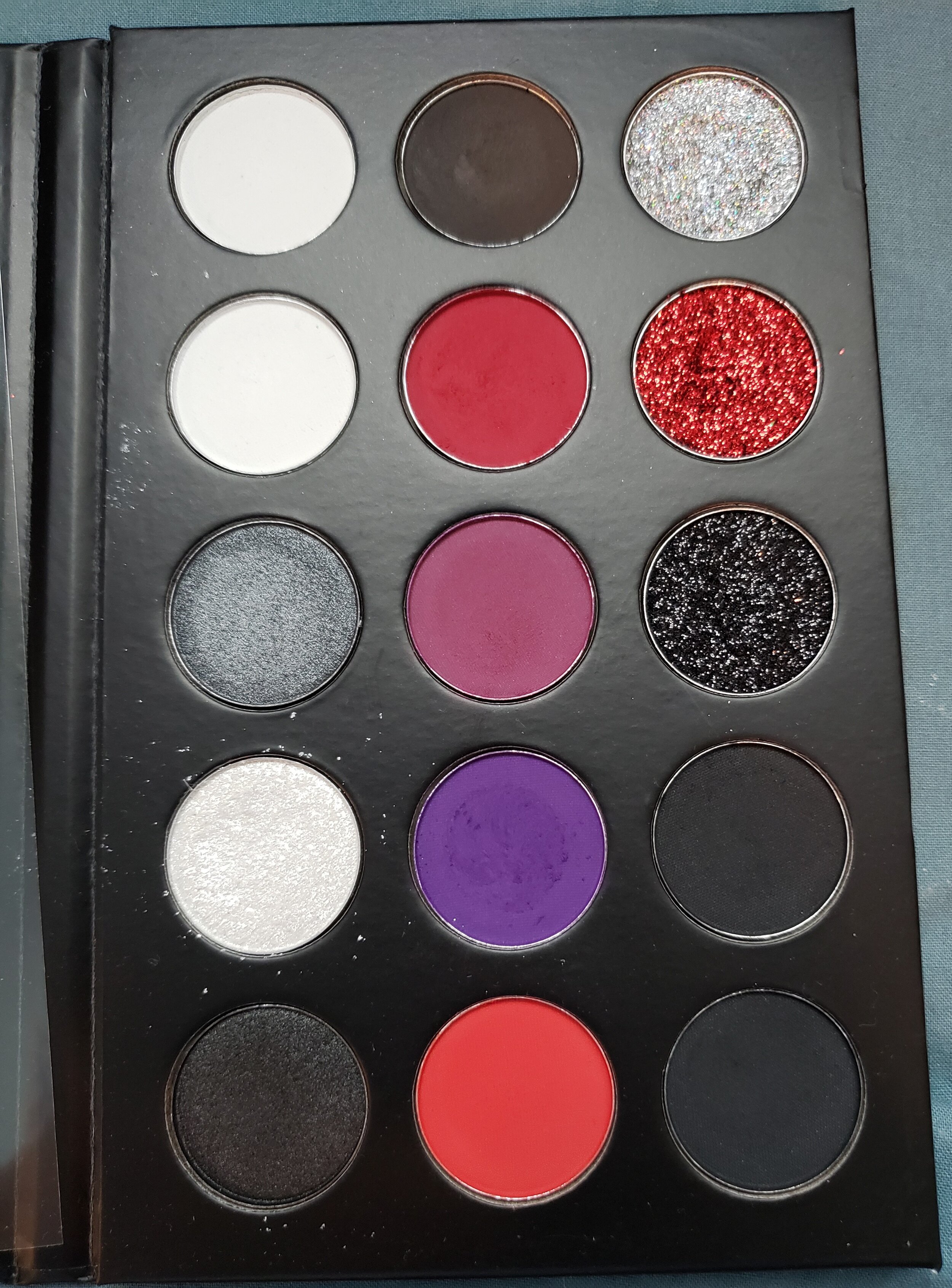
This palette contains what she considers the essential ‘goth’ color story. These are the colors she wanted to be all in one place, but could never find anywhere. And she included two of the same black shade, since that’s the one she runs out of the most!
I keep putting goth in quotes because while most of society believes that goth people only dress in black, wear black makeup, and walk around all angsty (and to be fair, some of them do), if you’ve had any exposure to the outside world and/or social media, you’ll have seen that black is a staple, but many goths wear a ton of color somewhere. I can point you to the Instagram of Victoria (@toribiohazard). Yes, her closet seems to only consist of black clothes, some dark reds thrown in. But look at her eye makeup posts - FILLED with bright, pigmented colors. So when you get down to my full review of this palette, don’t be surprised to see reds and purples, whites, and shiny iridescent shades going on.
This is where the “first for me” comes in. My friend sent me the palette to review. I’ve never had anyone do that before so of course I said yes. Anyone who’s been here for a while knows how much I’ve gotten into makeup the last 5 years or so. THAT SAID - do not assume that I will kiss her ass and write up a perfectly glowing review about this product. In all my reviews, I’ve always given my honest opinions, good or bad. This is no different. I hate that I have to put that disclaimer in but people can be….short sighted about a lot of things.
And that’s all I’ve got to say about that. On with the review!

Enjoy my weirdness…
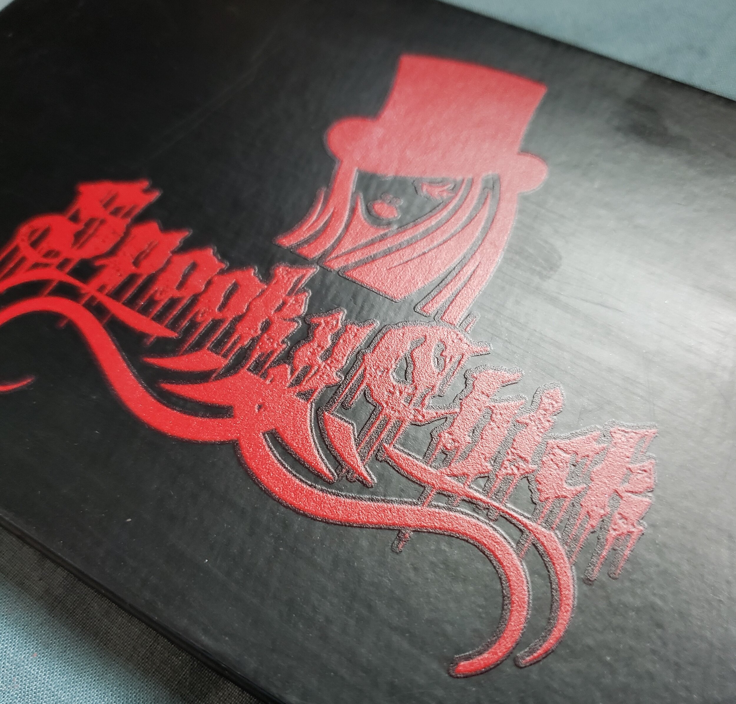
The packaging is a nice sturdy cardboard with magnetic closure. I love the red logo on black background, but I’m a red freak so hard to go wrong with that in my eyes. The ingredients and Cruelty Free logo are on the back. The outer package is smooth so it gets beat up easily. That doesn’t bother me, except for when you’d want to take pretty pictures. Otherwise, it’s totally fine.
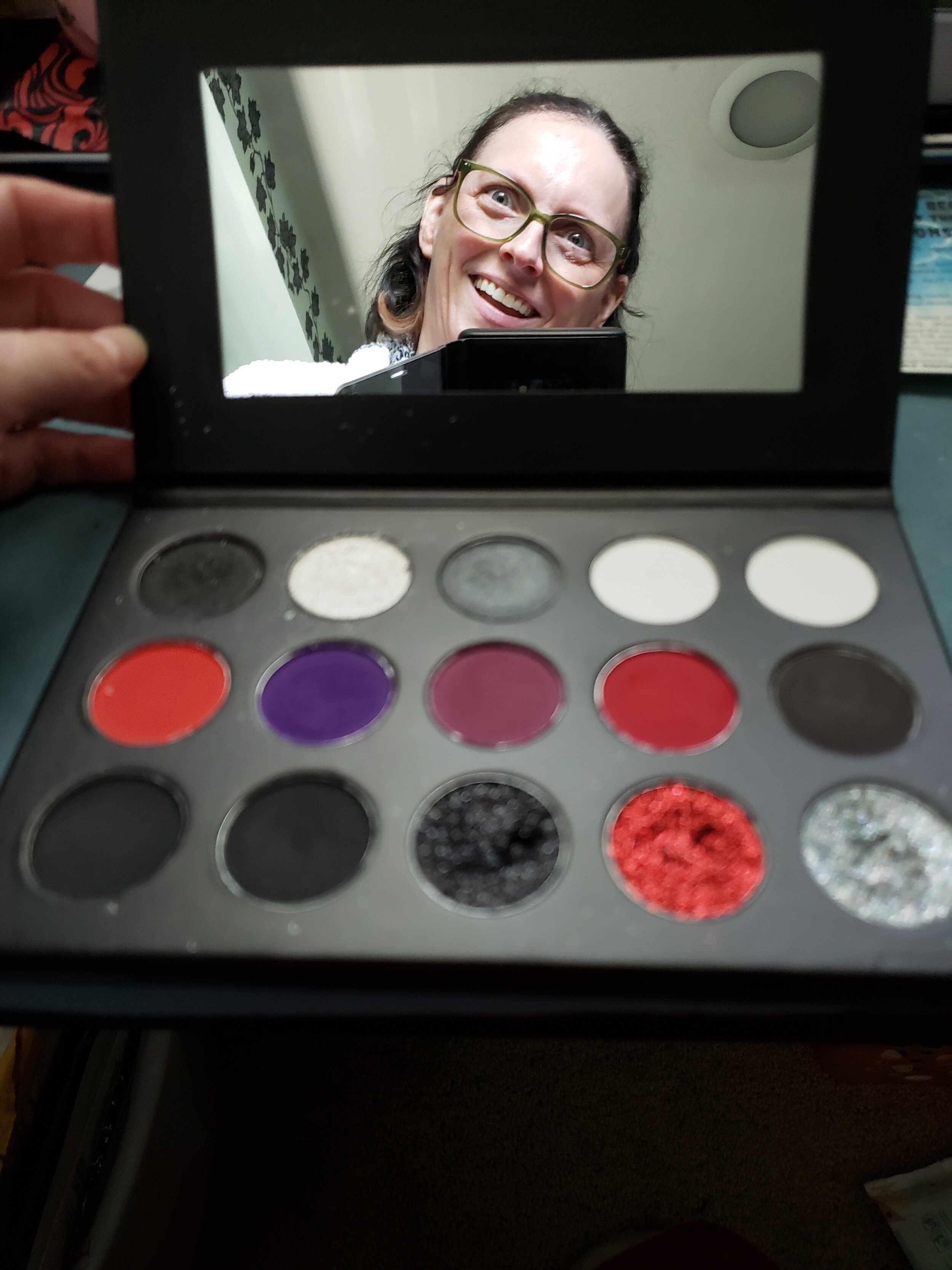
I do like the size of the mirror - and it’s not one of those cheap, wibbly ones you find in kid’s makeup. I usually don’t use palette mirrors, though, because they don’t have magnification. And my 52 year old, astimagtism laden eyes need their 10x, people!
You can see the inside of the palette is a bit of a mess. But it’s really just that 2nd from the top left, the GORGEOUS icy silvery white shade that causes it. A few of the other shadows are powedery but they don’t get all over the place.
Like you’re mom.
(Wow, sorry about that. I’m feeling feisty today. Fuck it - #sorrynotsorry.)
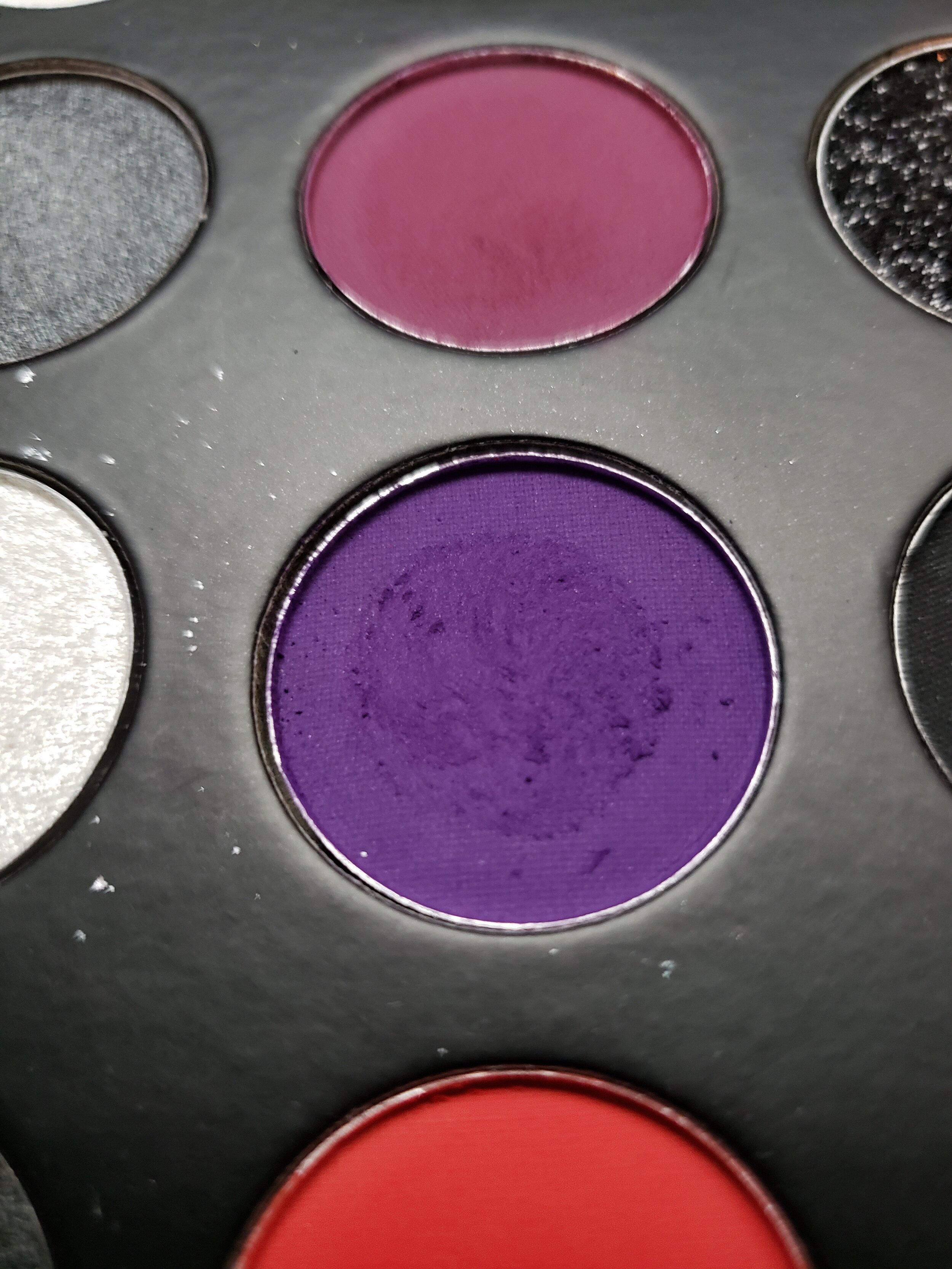
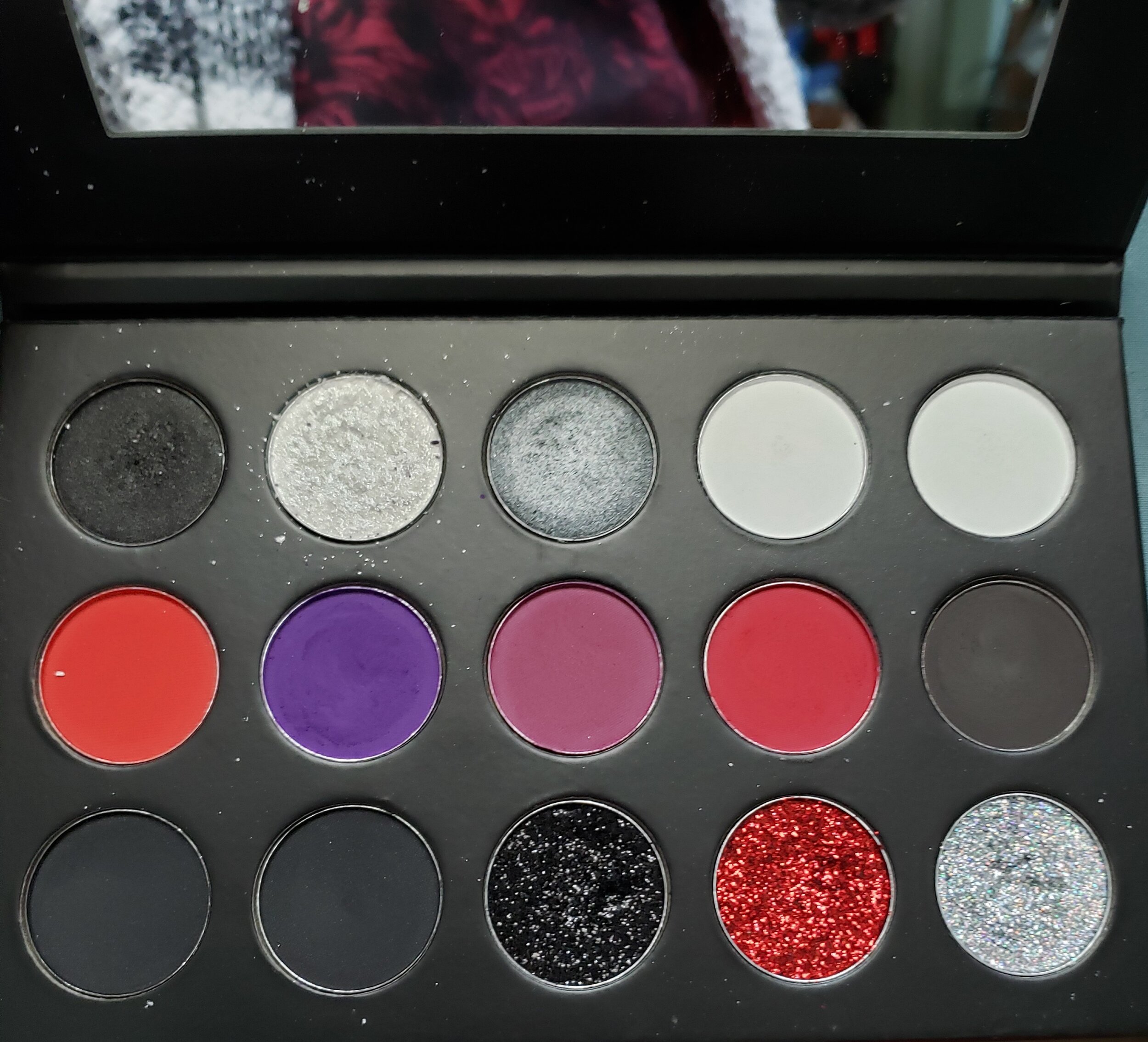
You can see the palette stayed relatively clean even after some swatches. The purple does get a little powdery so be careful. You’ll see in the eye looks further on just how pigmented some of these shades are, that purple being the best one.
Let me try to go through each row.
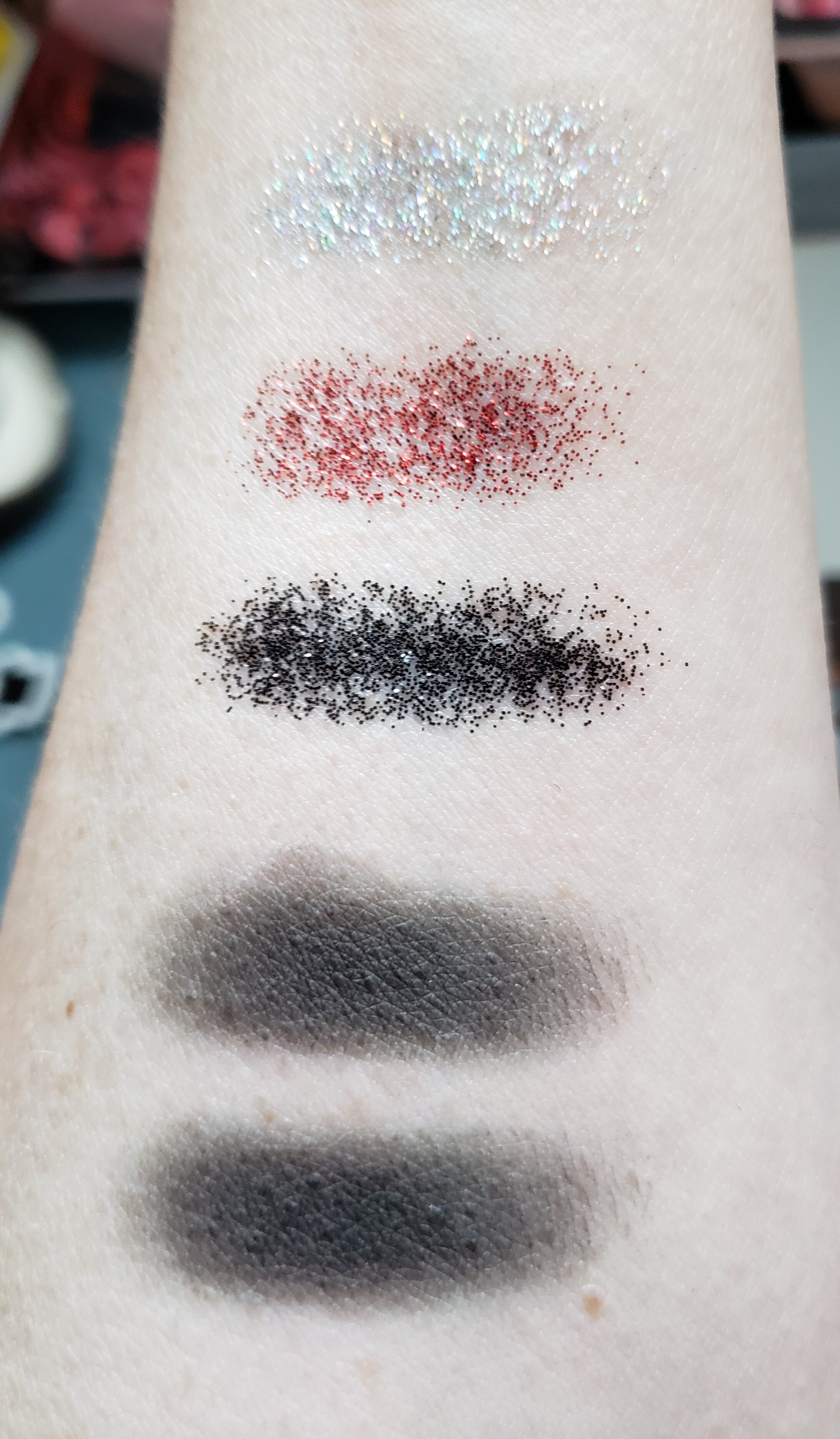
TOP ROW: Basically we’ve got a satin finish black, icy white shiimmer, satin gunmetal grey, a matte very very light grey, and a matte white. The first three feel like BUTTAH and work well. I’m really only disappointed in the last two shade. First, they don’t look all that different on the eyes. Second they are hella dry and don’t swatch well so you can’t really tell what they’re like until you use them. And third, they are the least pigmented of the bunch. Almost to the point of being hard to work with. You can work with them, though, so they’re not completely lost causes. I just wish there was more color differentiation and that the white was way more pigmented. To be fair, it’s hard to find a white eye shadow that shows up well (at least on my pale skin).
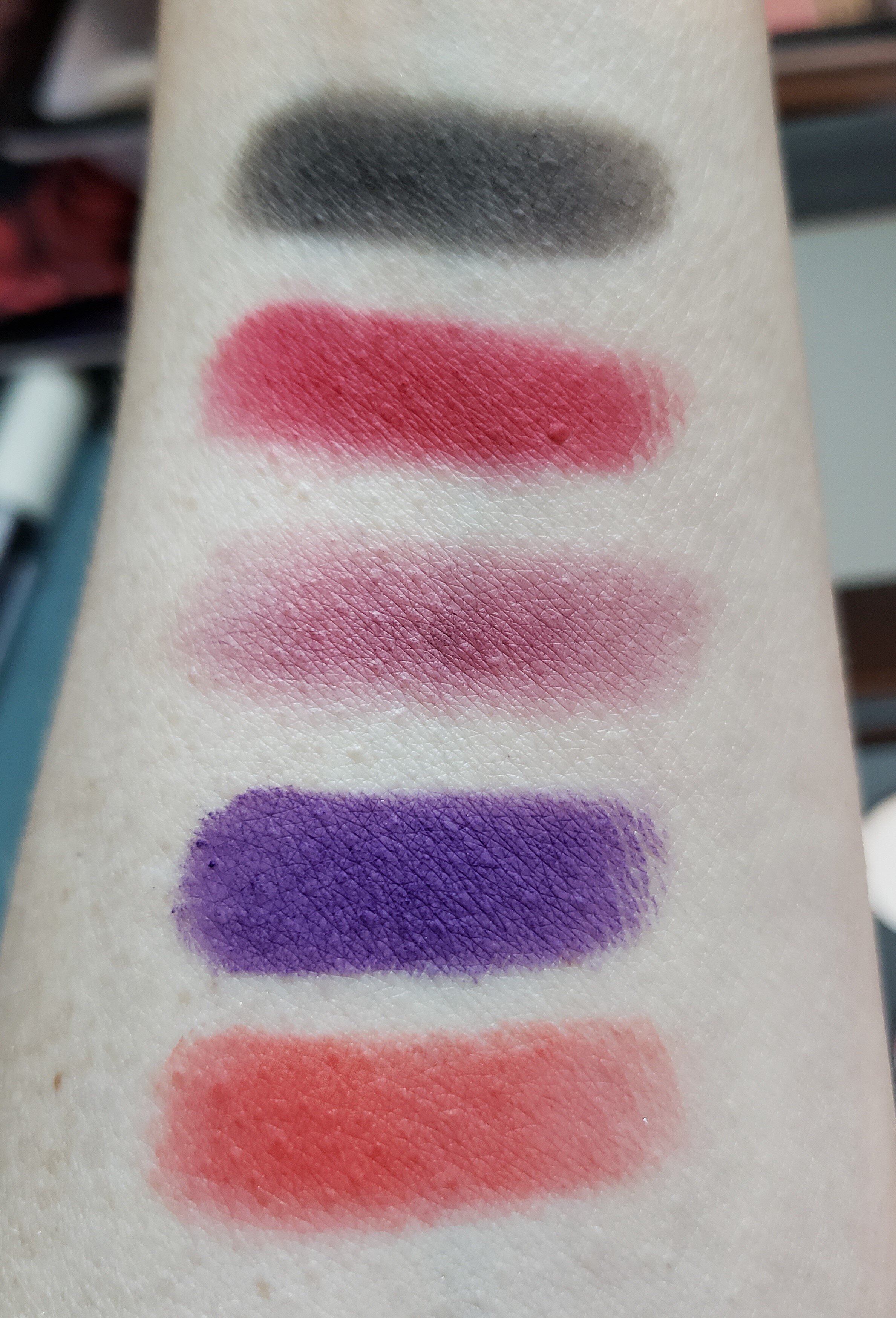
SECOND ROW (all matte): warm red, grape purple, berry red, deep red, and charcoal grey. The first red is dry and a little finicky but works. The purple, deep red, and grey are like BUTTAH and probably my favorites in the whole palette. Also, layering the warm and deep red together look great. The berry shade is a little dry but again, works well.
LAST ROW: We start with two matte blacks, and the last three shades are actually pressed glitters - or they’re in some kind of gel suspension. Makes them easy to work with. I’m not a glitter kinda gal generally speaking but that silver, irridescent one calls to me in my sleep…(Just always be aware that glitters CAN be problematic in the sense of literally scratching your eyeballs. Didn’t stop me from trying them because I’m an adult and can make my own informed decisions.) The blacks are dry but they still deliver a lot of pigment.
Let’s take a look at some of my creations. I wanted to use every shade in the palette, and I have, and used them over several weeks so I’d have enough of an idea how they work - together, alone, etc.
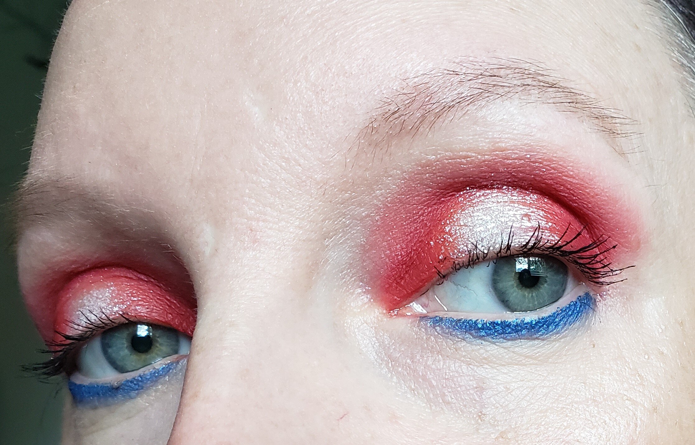
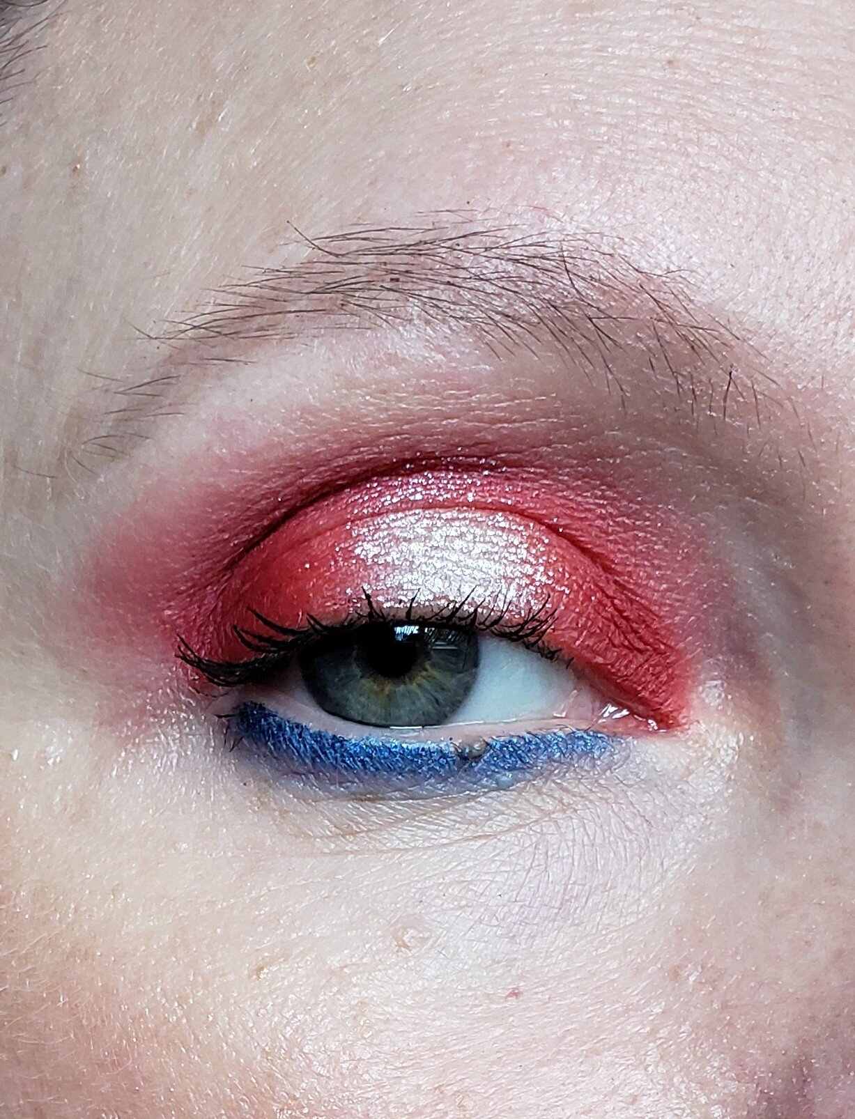
Obviously the blue in the first look is from another palette, but this was for July 4th so I had to. I mixed the warm and deep reds and put that icy shimmer in the middle. So gorgeous. And these reds lasted all day and into the evening. So, GOOD JOB, REDS!
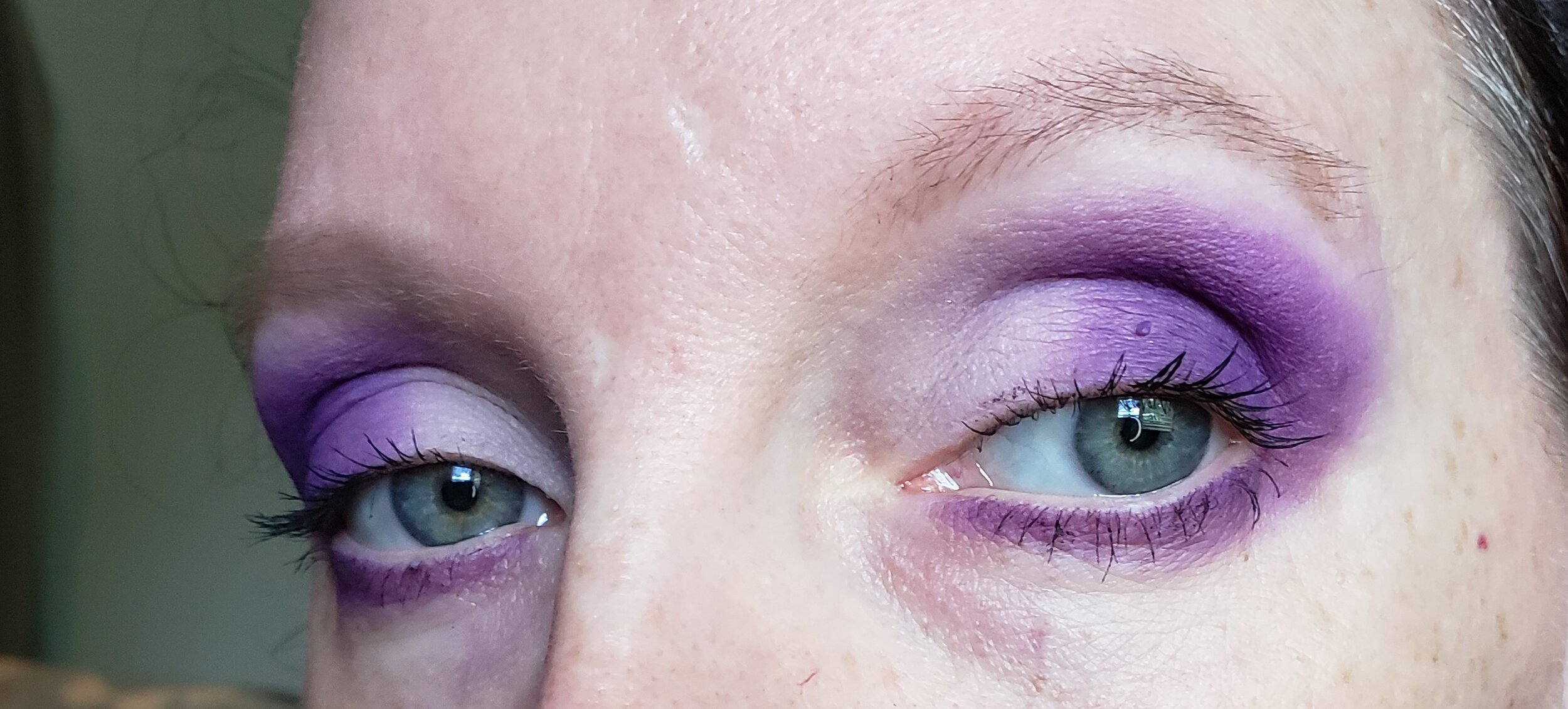
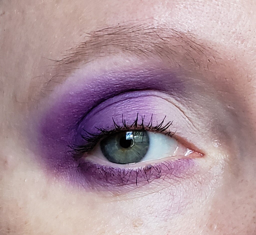
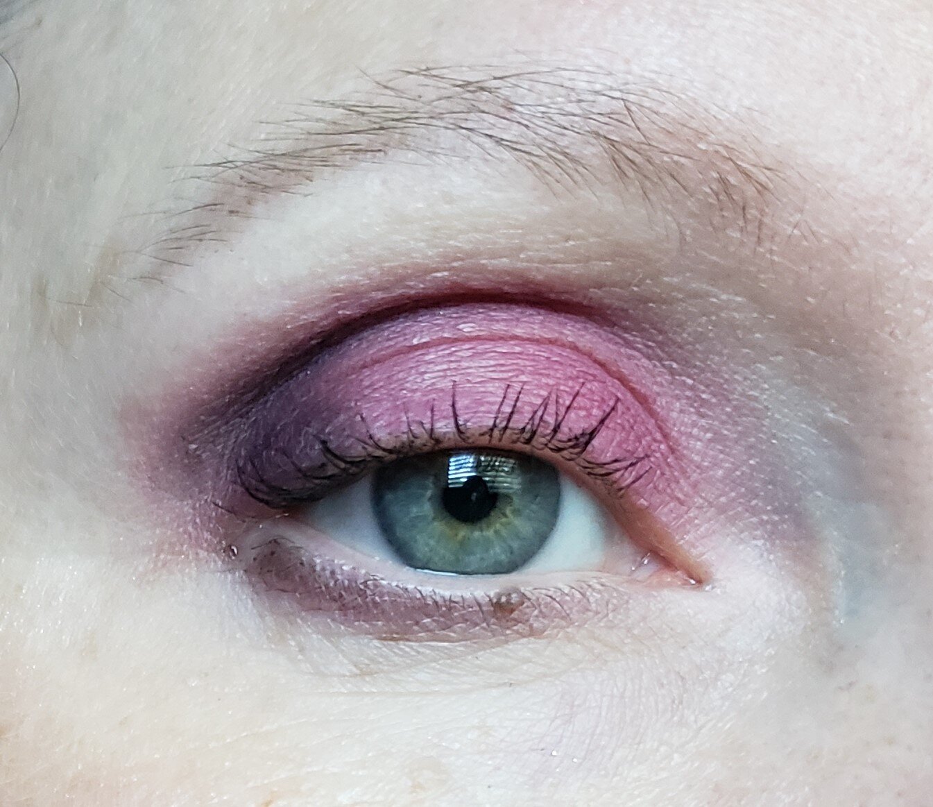
The second was using that purple and the white. Now, I only dipped into the purple once and got 95% of this look completed. On both eyes! I only dipped back in one more time to sweep the color down around the outside corner of my eyes. HOLY HELL, this is such a gorgeous color. Just be careful when you go in with your brush. You have been warned.
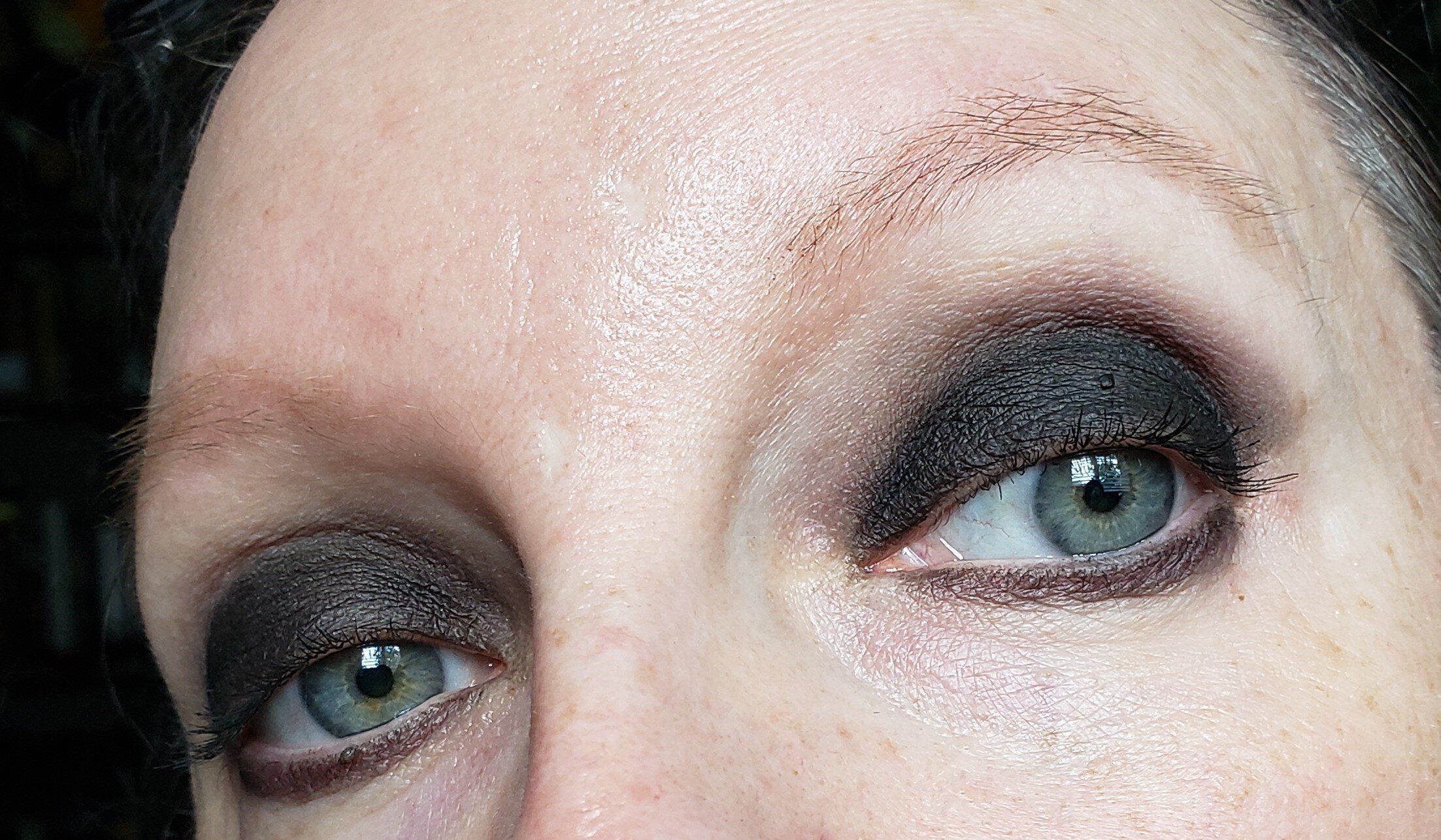
The first look here is was just using the black. That’s it. I wanted to see how it stood on its own two feet, so to speak. No extra primer or sticky base, no black liner or gel color to help saturate it. On its own, this black is pretty damned good.
The second I used that berry shade with some black in the outer corners. It’s not very pigmented but I think it could look super opaque with a base under it.
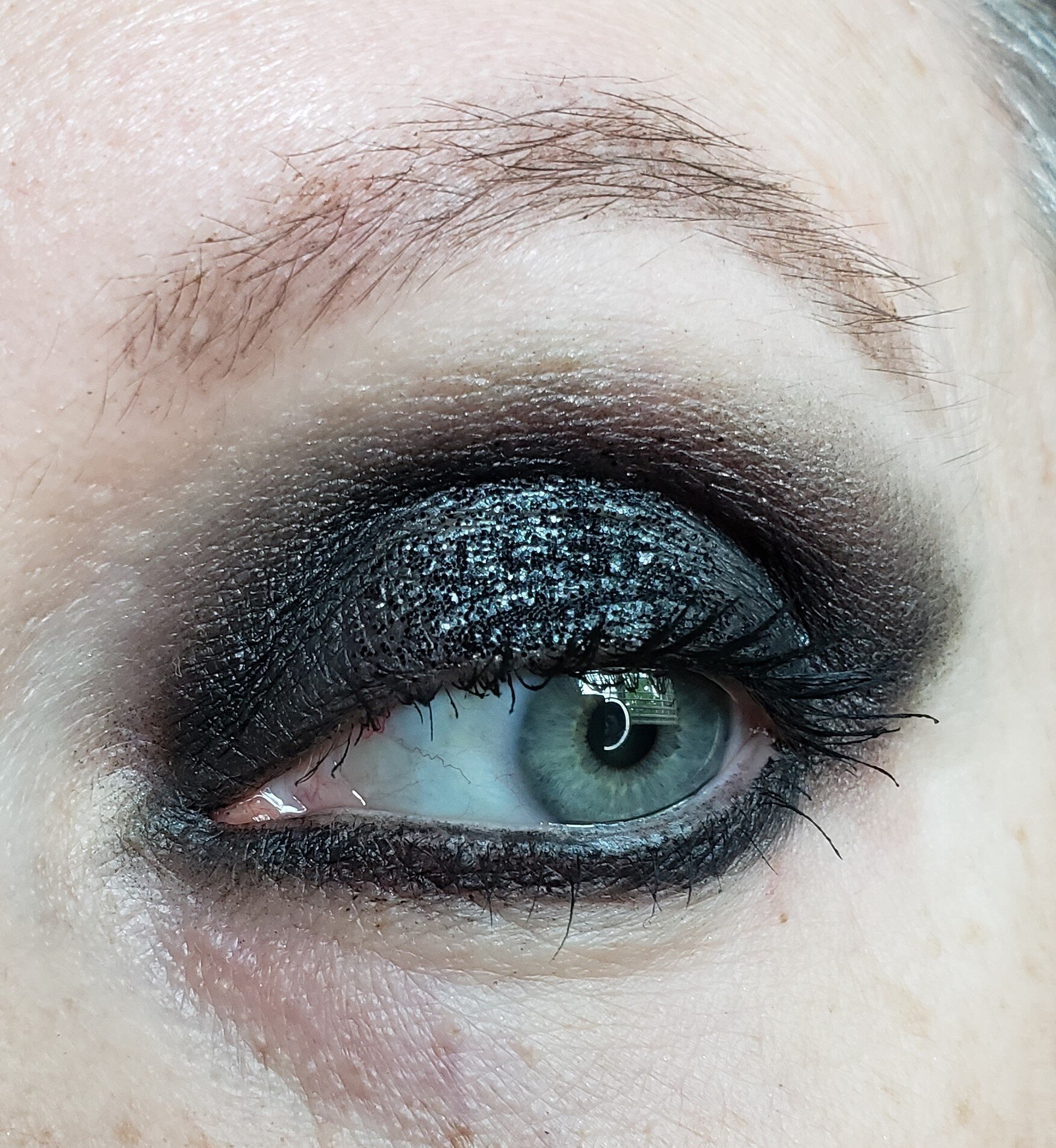
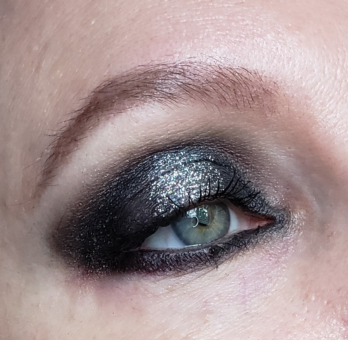
The last two looks had the same base. I think I mixed the black and deep charcoal grey satins. Then on one eye I put the black glitter, and the other I used the silver irridescent glitter. The black doesn’t pick up as well, and I’m not sure why. But it took a little time just to get that small amount on my eye ball. I may try a glitter glue in the future to see if that helps, but for this first round I wanted to see it on its own. That irridescent glitter, though, is like manna from heaven. Didn’t have to work hard to get that on there and look stunning.
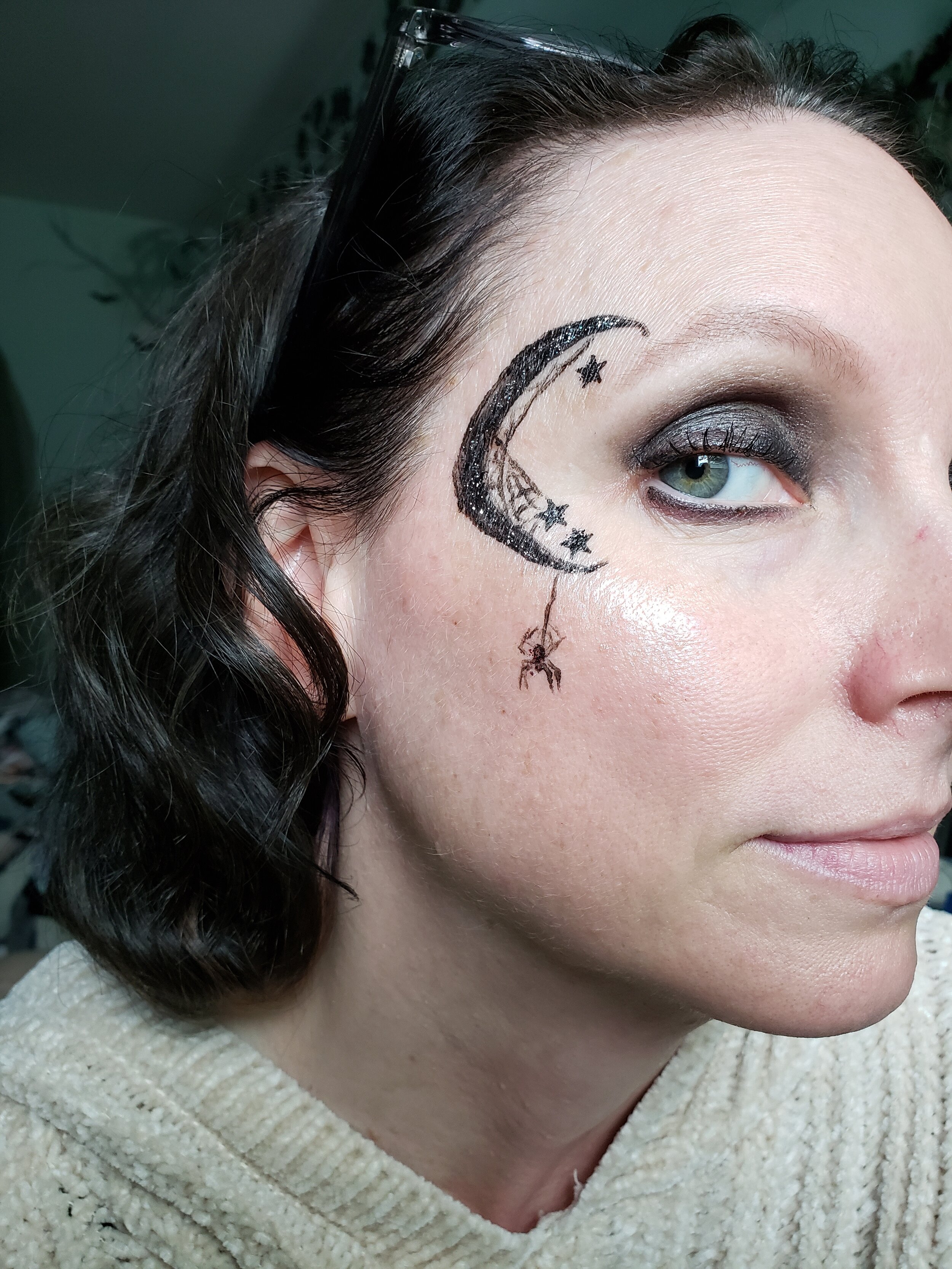
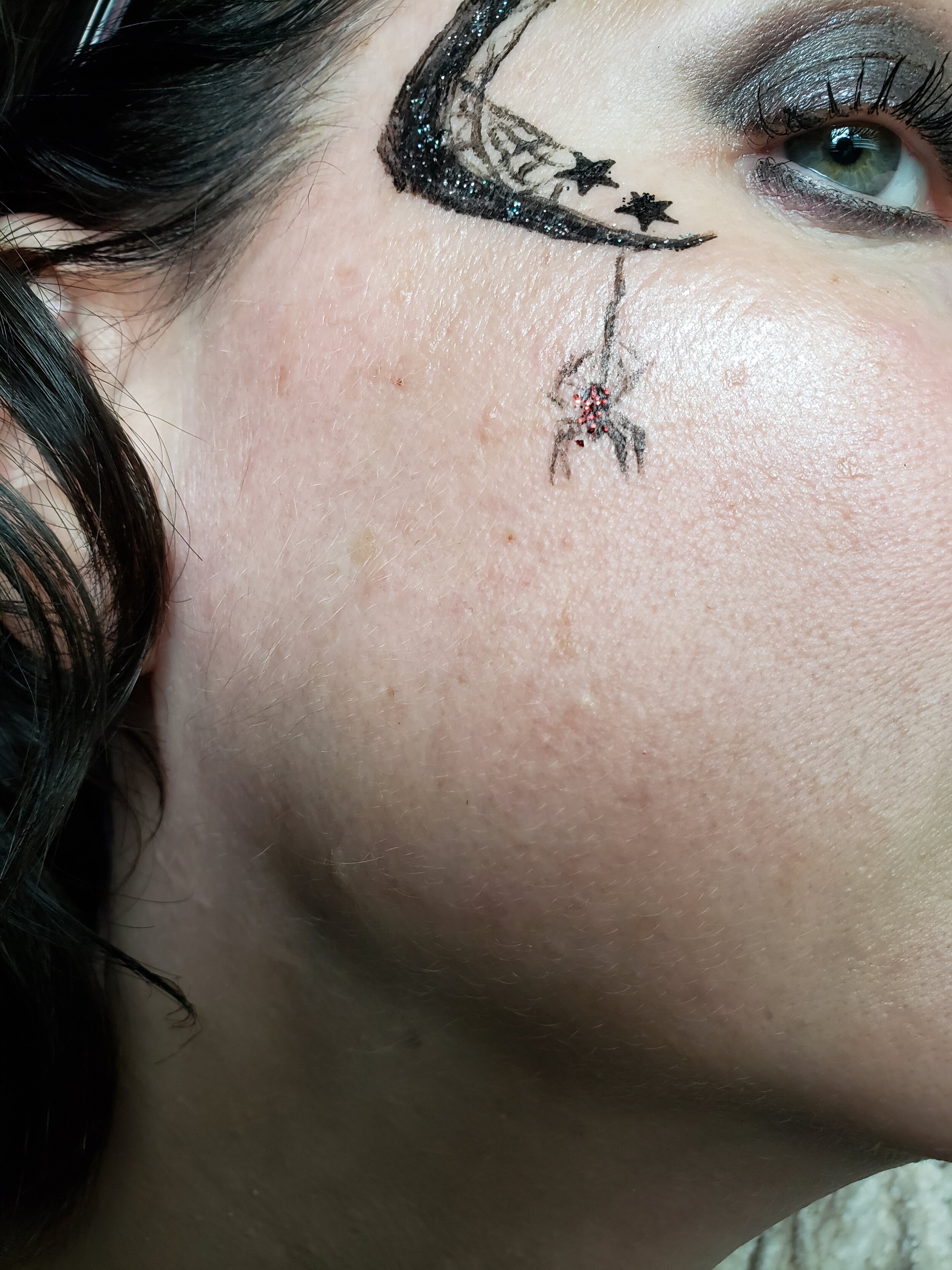
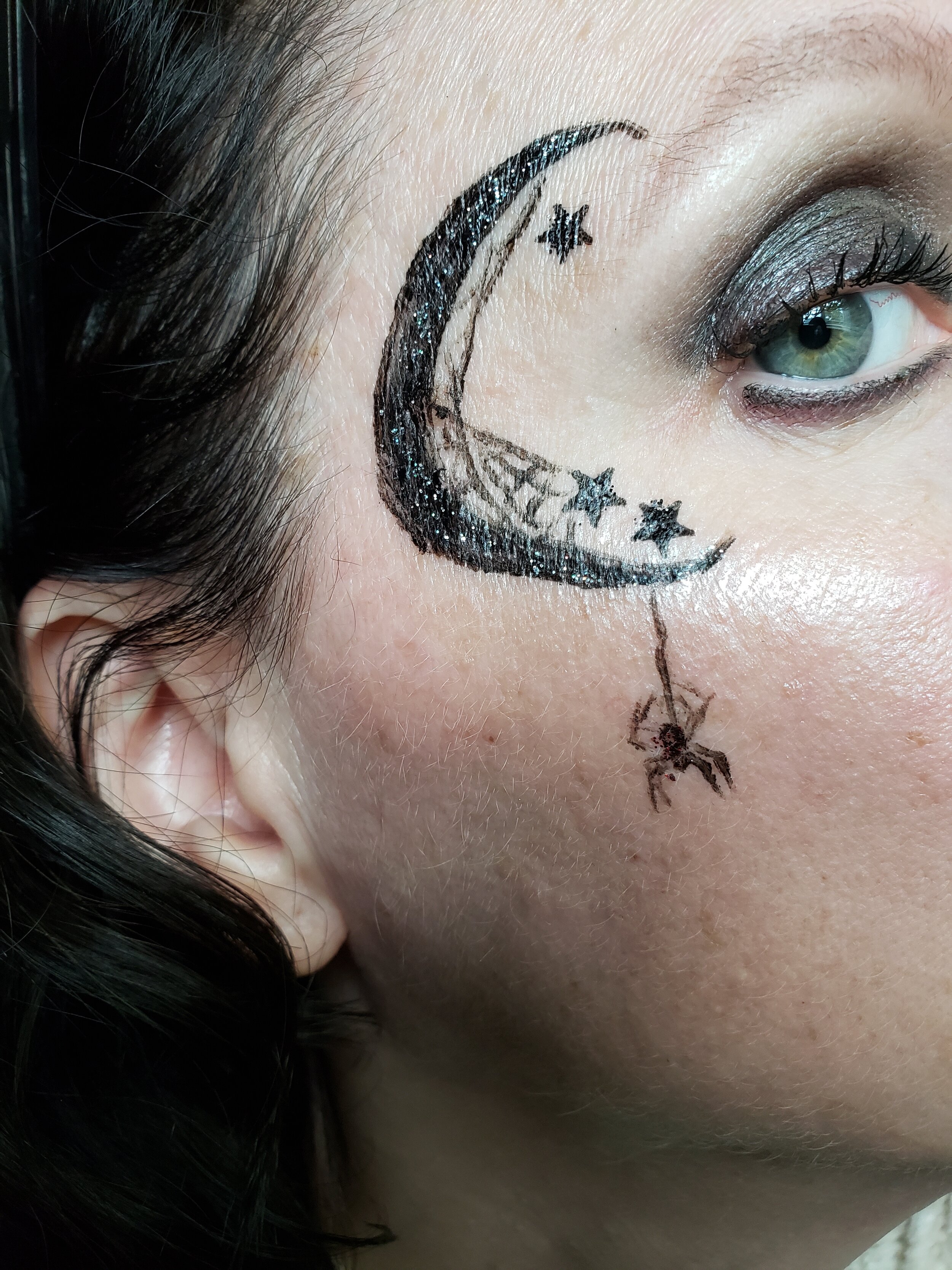
These were just for shits and giggs. I put the black and irridescent glitters over the moon drawn with liquid liner, and the red over the spider of the same base. The red and black work almost the same. Little hard to get on the brush/finger, but they’re fine for what they are.
That about covers it. Over all, I really enjoyed this palette. The quality is good, with just a few exceptions, and the color story is great. I agree with the store owner that you really can’t find all these shades together in one palette so I’m glad she went out and did it herself. This would also make a great companion if you want to play with brighter colors, go rainbow, whatever, but want to add a little dark drama to it.
Interested in trying these for yourself? Head on over to SPOOKYCHICK and get yours today.